
finca el encanto
AGRO ECO-TURISM
El Encanto is a family owned farm dedicated to the cultivation for sale of fruits and exotic flowers such as the bird of paradise. Amidst the pandemic of 2020 and taking advantage of their fertile lands, they started to experiment with a small harvest of organic coffee. Surprised by the success and response from friends and family, they decided to include the coffee into their production. At this point, and with plans to get into the commercialization of their new product, they found out that a certificate from the Federación Nacional de Cafeteros de Colombia was needed to move forward.
Shortly after, they entered an open call and earned a grant from the SENA institute for the development of new entrepreneurships. This opened the opportunity to consolidate the brand of Finca El Encanto, including the register of the name and logo. In April 2023, they contacted us and our team became a strategic partner in building the visual identity of their family company and their newborn coffee.
The Challenge
The main goal was to not only represent their organic coffee, but the whole experience. They needed a coherent and authentic representation of what Finca El Encanto is: a unique space surrounded by diversity and inspiring experiences, where time seems to slow down. This is place where the value of tradition comes to life, creating a genuine connection with those who inhabit it to the point they can safely say "This is a part of me".
Our Solution
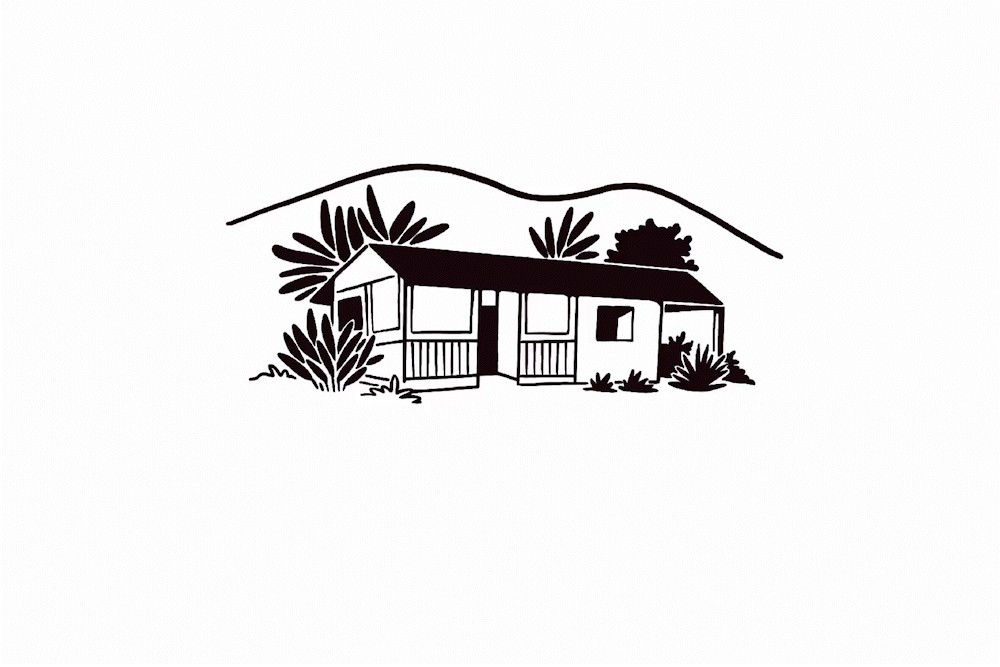
As the main element we wanted to highlight the family legacy. Our route map was centered on the experience and sensations of traveling to a small town and reconnecting with what has been inherited. We needed to show the sense of belonging to a place surrounded by nature. The answer was there all the time: the family house is that home that could be the timeless symbol, one that could be transversal to all the generations, past present and future. The space that allows for their different business endeavors to exist.
Our Solution
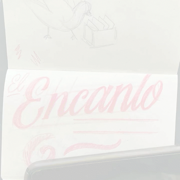
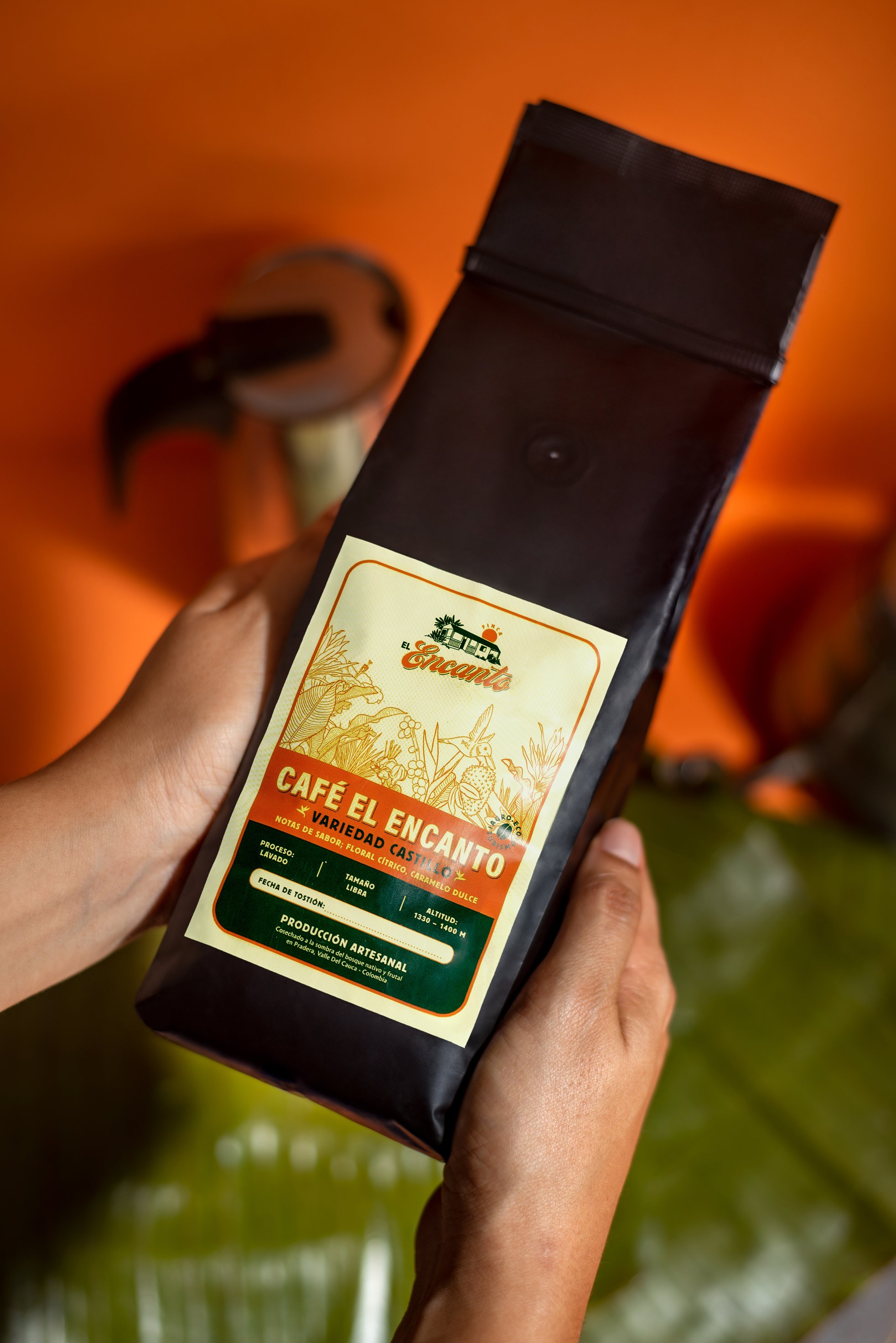
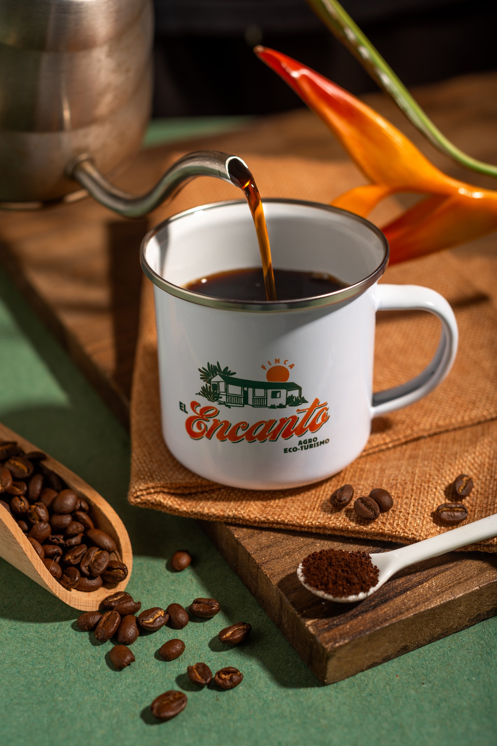
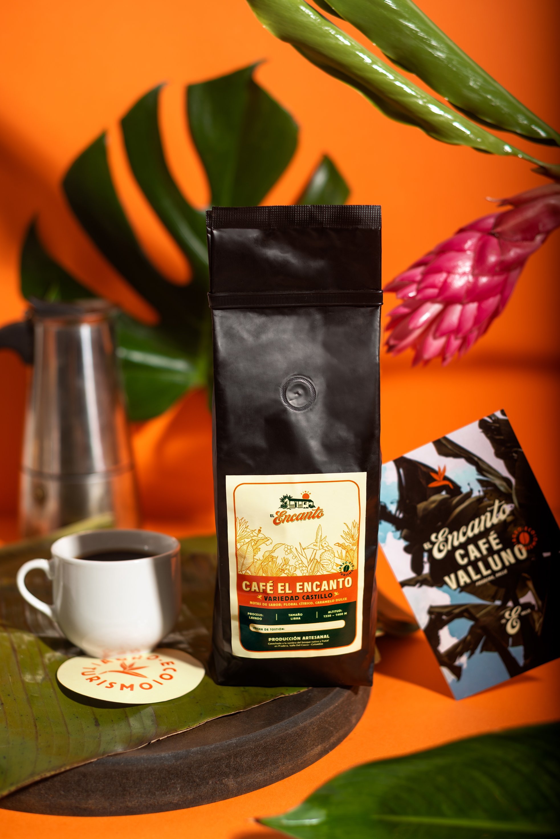
For the logotype we developed a custom lettering that brings a lot of the human labour behind their processes, inspired by the hand crafted feel and freshness of vernacular sign painting found in small town walls and signage. A timeless gesture that connects us to our ancestors.

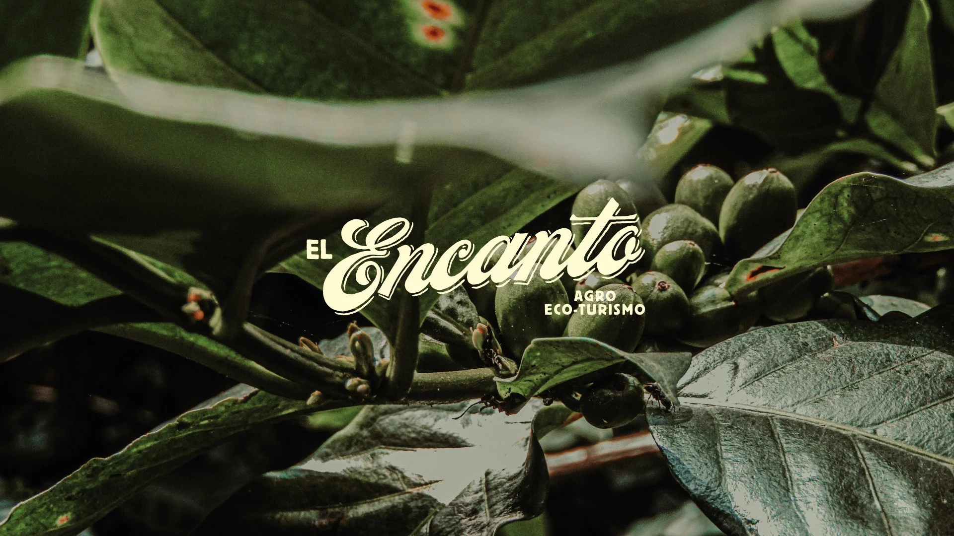
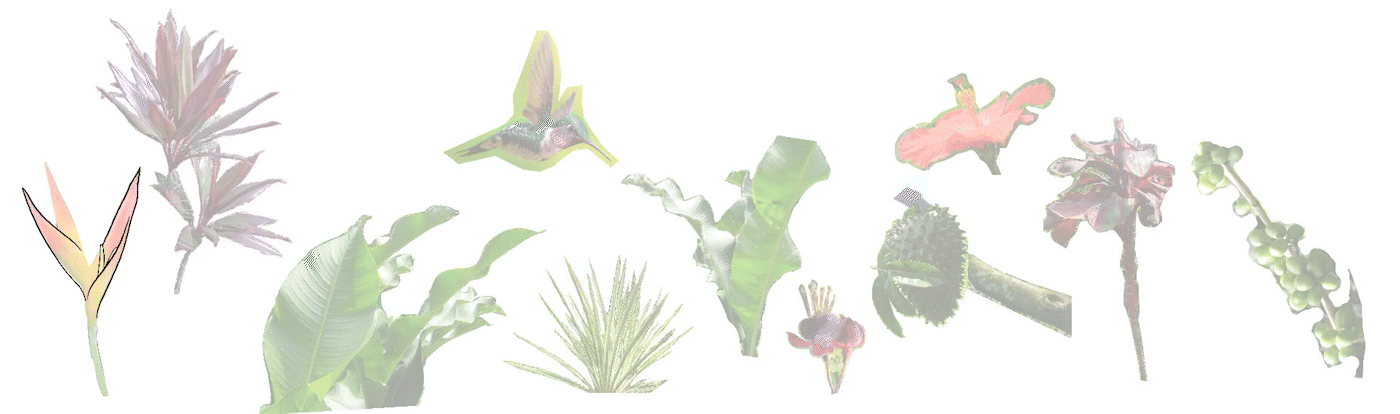
To complete the visual identity, we supported our main icon and logotype with a color palette inspired by tones of the Finca (green forest, orange flowers, off-white coffee bags). And then as a final touch we added some illustrations that allowed us to mix, match and strengthen the intention and message of the brand across different touch points. A flexible system that feels as a breath of fresh air while sipping a great organic coffee, contemplating the beauty of nature. A sunny day surrounded by a native forest. This is Finca El Encanto.


What are you waiting for? Let’s create something amazing together!